I design interfaces for startups and cultural institutions in Tokyo, where the details others skip carry the weight.

Interaction design, accessibility, and motion. Nine years of shipping work that holds up at 200% zoom, on a keyboard, and at 3G speeds.

— currently in Nakameguro

Available for one project from September 2026 · Currently building a bilingual design system for Kyoto Bunka Archive · Available for one project from September 2026 · Currently building a bilingual design system for Kyoto Bunka Archive · Available for one project from September 2026 · Currently building a bilingual design system for Kyoto Bunka Archive · Available for one project from September 2026 · Currently building a bilingual design system for Kyoto Bunka Archive · Available for one project from September 2026 · Currently building a bilingual design system for Kyoto Bunka Archive · Available for one project from September 2026 · Currently building a bilingual design system for Kyoto Bunka Archive ·

Selected collaborators

  • Mori Art Museum
  • Kyoto Bunka Archive
  • Hanabi Bank
  • Studio Kaji
  • Tsukiji Public Library

Featured work

Two projects where the measurable problem was friction, and the fix was mostly subtraction.

Cultural institution · 20259 min read

Rebuilding ticketing for Mori Art Museum

Ticket abandonment sat at 41% on mobile. We cut the flow from nine screens to four, made date selection keyboard-operable, and shipped a seat-free queue model. Abandonment dropped to 17% in eight weeks.
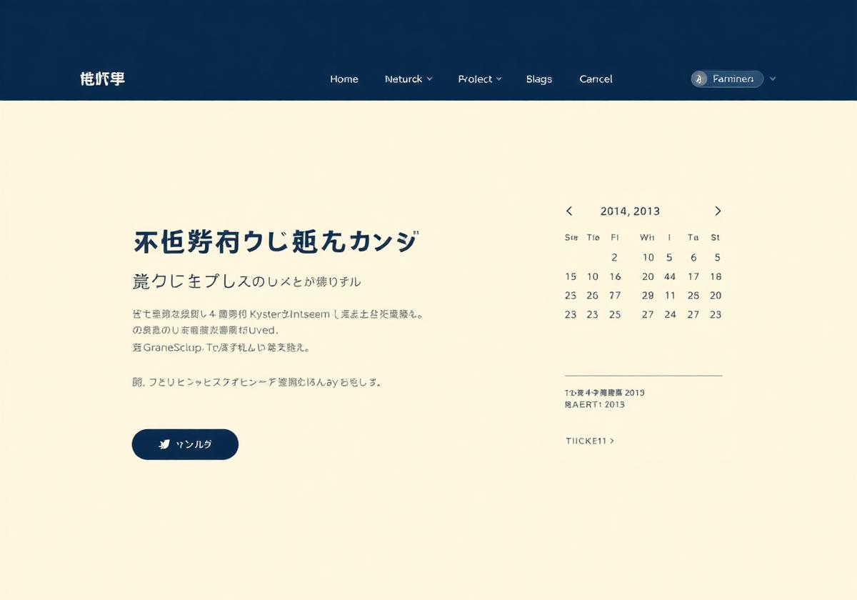
Interface screenshot from Rebuilding ticketing for Mori Art Museum
Fintech · 20246 min read

Hanabi Bank: onboarding at 200% text size

Every screen was audited at 200% zoom and with VoiceOver in Japanese and English. 38 contrast failures closed, error copy rewritten to name the fix. Support tickets about sign-up fell by a third.

Interface screenshot from Hanabi Bank: onboarding at 200% text size
Accessibility

Contrast is a decision, not a checkbox

I test every palette pair before it reaches a component. On the Hanabi Bank rebuild that meant rejecting the brand's own grey at 2.9:1 and proposing a replacement the marketing team could still use in print.

Contrast audit
  • Ink on paper13.8 : 1passes
  • Grey on paper2.9 : 1fails
  • Amber on ink8.4 : 1passes
Motion

Movement should explain, then get out of the way

350–600ms, no overshoot, and a full stop before anything else moves. Reduced-motion users get the same information with opacity alone — never a degraded version of the page.

Entrance timing

Primary · 600ms

Secondary · +50ms

Ambient · 18s loop

Systems

Tokens are the handoff

Figma variables named exactly as the CSS custom properties they become. On the Kyoto Bunka Archive system, that removed a weekly spec meeting entirely.

Diagram of design tokens flowing from Figma variables into component code

Figma resources

Files I built for my own work and kept maintaining. Free, no email wall.

42 variables · 1.2k downloads

Motion Tokens for Figma

Duration, easing, and travel-distance variables mapped one-to-one to CSS custom properties, so handoff stops being a translation exercise.

Open in Figma →
Free · CC0

Contrast Grid Kit

Every pair in your palette, scored.

Open in Figma →
68 components

Focus State Library

Visible focus for keyboard users.

Open in Figma →
Bilingual

JP/EN Type Scale

Latin and kana on one vertical rhythm.

Open in Figma →
Theo redrew our ticket flow in three weeks and then spent another two testing it with visitors who use screen readers. Nobody had done that for us before.
Aya ShimizuHead of Digital, Mori Art Museum
He gave our engineers a token file they could actually build from. Our design-to-code review time went from four days to one.
Daniel OkonkwoEngineering Lead, Hanabi Bank

Tell me what’s breaking, and who it’s breaking for.

One project at a time, starting September 2026. Audits and short engagements are easier to fit in sooner.

Or email directly — theo@nakamura.design